Components
A Lit component is a reusable piece of UI. You can think of a Lit component as a container that has some state and that displays a UI based on its state. It can also react to user input, fire events—anything you'd expect a UI component to do. And a Lit component is an HTML element, so it has all of the standard element APIs.
Creating a Lit component involves a number of concepts:
- Defining a component: A Lit component is implemented as a custom element, registered with the browser.
- Rendering: A component has render method that's called to render the component's contents. In the render method, you define a template for the component.
- Reactive properties: Properties hold the state of the component. Changing one or more of the components' reactive properties triggers an update cycle, re-rendering the component.
- Styles: A component can define encapsulated styles to control its own appearance.
- Lifecycle: Lit defines a set of callbacks that you can override to hook into the component's lifecycle—for example, to run code when the element's added to a page, or whenever the component updates.
Defining a component
A Lit component is defined by creating a class, extending it with LitElement and registering the class with the browser:
@customElement("simple-greeting")
export class SimpleGreeting extends LitElement {
  /* ... */
}
The @customElement decorator is shorthand for calling customElements.define, which registers a custom element class with the browser and associates it with an element name (in this case, simple-greeting).
A Lit component is an HTML element
When you define a Lit component, you're defining a custom HTML element. So you can use the new element like you'd use any built-in element:
<simple-greeting name="Markup"></simple-greeting>
const greeting = document.createElement("simple-greeting");
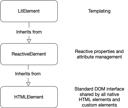
The LitElement base class is a subclass of HTMLElement, so a Lit component inherits all of the standard HTMLElement properties and methods.
Specifically, LitElement inherits from ReactiveElement, which implements reactive properties, and in turn inherits from HTMLElement.
Providing good TypeScript typings
TypeScript will infer the class of an HTML element returned from certain DOM APIs based on the tag name. For example, document.createElement('img') returns an HTMLImageElement instance with a src: string property.
Custom elements can get this same treatment by adding to the HTMLElementTagNameMap as follows:
@customElement("my-element")
export class MyElement extends LitElement {
  @property({ type: Number })
  aNumber: number = 5;
  /* ... */
}

declare global {
  interface HTMLElementTagNameMap {
    "my-element": MyElement;
  }
}
By doing this, the following code properly type-checks:
const myElement = document.createElement("my-element");
myElement.aNumber = 10;
It is recommended to add an HTMLElementTagNameMap entry for all elements authored in TypeScript, and ensuring to publish the .d.ts typings in the npm package.
Rendering
A template defines what the component should render. Templates can include expressions, which are placeholders for dynamic content.
To define a template for a Lit component, add a render() method:
import { LitElement, html } from "lit";
import { customElement } from "lit/decorators.js";

@customElement("my-element")
class MyElement extends LitElement {
  render() {
    return html`<p>Hello from my template.</p>`;
  }
}
The render() method defines your component's internal DOM.
The template is written in HTML inside a JavaScript tagged template literal using Lit's html tag function.
Lit templates can include JavaScript expressions. You can use expressions to set text content, attributes, properties, and event listeners. The render() method can also include any JavaScript—for example, you can create local variables for use in expressions.
Renderable values
Typically, the component's render() method returns a single TemplateResult object (the same type returned by the html tag function), an object that describes the HTML for Lit to render.
However, it can return anything that Lit can render as the child of an HTML element:
- Primitive values like string, number, or boolean
TemplateResultobjects created by thehtmlfunction- DOM Nodes
The sentinel values
nothingandnoChange - Arrays or iterables of any of the supported types
This is almost identical to the set of values that can be rendered to a Lit child expression. The one difference is that a child expression can render an SVGTemplateResult, returned by the svg function. This kind of template result can only be rendered as the descendant of an <svg> element.
A good render() method
To take best advantage of Lit's functional rendering model, the render() method should follow these guidelines:
- Avoid changing the component's state
- Avoid producing any side effects
- Use only the component's properties as input
- Return the same result when given the same property values
Following these guidelines keeps the template deterministic, and makes it easier to reason about the code.
In most cases you should avoid making DOM updates outside of render(). Instead, express the component's template as a function of its state, and capture its state in properties.
For example, if your component needs to update its UI when it receives an event, have the event listener set a reactive property that is used in render(), rather than manipulate the DOM directly.
For more information, see Reactive properties.
Composing templates
You can compose Lit templates from other templates. The following example composes a template for a component called <my-page> from smaller templates for the page's header, footer, and main content:
import { LitElement, html } from "lit";
import { customElement, property } from "lit/decorators.js";

@customElement("my-page")
class MyPage extends LitElement {
  @property({ attribute: false })
  article = {
    title: "My Nifty Article",
    text: "Some witty text.",
  };

  headerTemplate() {
    return html`<header>${this.article.title}</header>`;
  }

  articleTemplate() {
    return html`<article>${this.article.text}</article>`;
  }

  footerTemplate() {
    return html`<footer>Your footer here.</footer>`;
  }

  render() {
    return html`
      ${this.headerTemplate()} ${this.articleTemplate()} ${this.footerTemplate()}
    `;
  }
}
In this example, the individual templates are defined as instance methods, so a subclass could extend this component and override one or more templates.
You can also compose templates by importing other elements and using them in your template:
import { LitElement, html } from "lit";
import { customElement } from "lit/decorators.js";

import "./my-header.js";
import "./my-article.js";
import "./my-footer.js";

@customElement("my-page")
class MyPage extends LitElement {
  render() {
    return html`
      <my-header></my-header>
      <my-article></my-article>
      <my-footer></my-footer>
    `;
  }
}
When templates render
A Lit component renders its template initially when it's added to the DOM on a page. After the initial render, any change to the component's reactive properties triggers an update cycle, re-rendering the component.
Lit batches updates to maximize performance and efficiency. Setting multiple properties at once triggers only one update, performed asynchronously at microtask timing.
During an update, only the parts of the DOM that change are re-rendered. Although Lit templates look like string interpolation, Lit parses and creates static HTML once, and then only updates changed values in expressions after that, making updates very efficient.
DOM Encapsulation
Lit uses shadow DOM to encapsulate the DOM a component renders. Shadow DOM lets an element create its own, isolated DOM tree that's separate from the main document tree. It's a core feature of the web components specifications that enables interoperability, style encapsulation, and other benefits.
Reactive Properties
Lit components receive input and store their state as JavaScript class fields or properties. Reactive properties are properties that can trigger the reactive update cycle when changed, re-rendering the component, and optionally be read or written to attributes.
class MyElement extends LitElement {
  @property()
  name: string;
}
Lit manages your reactive properties and their corresponding attributes. In particular:
- Reactive updates: Lit generates a getter/setter pair for each reactive property. When a reactive property changes, the component schedules an update.
- Attribute handling: By default, Lit sets up an observed attribute corresponding to the property, and updates the property when the attribute changes. Property values can also, optionally, be reflected back to the attribute.
- Superclass properties: Lit automatically applies property options declared by a superclass. You don't need to redeclare properties unless you want to change options.
- Element upgrade: If a Lit component is defined after the element is already in the DOM, Lit handles upgrade logic, ensuring that any properties set on an element before it was upgraded trigger the correct reactive side effects when the element upgrades.
Public properties and internal state
Public properties are part of the component's public API. In general, public properties—especially public reactive properties—should be treated as input.
The component shouldn't change its own public properties, except in response to user input. For example, a menu component might have a public selected property that can be initialized to a given value by the owner of the element, but that is updated by the component itself when the user selects an item. In these instances, the component should dispatch an event to indicate to the component's owner that the selected property changed. See Dispatching events for more details.
Lit also supports internal reactive state. Internal reactive state refers to reactive properties that aren't part of the component's API. These properties don't have a corresponding attribute, and are typically marked protected or private in TypeScript.
@state()
private _counter = 0;
The component manipulates its own internal reactive state. In some cases, internal reactive state may be initialized from public properties—for example, if there is an expensive transformation between the user-visible property and the internal state. As with public reactive properties, updating internal reactive state triggers an update cycle. For more information, see Internal reactive state.
Public reactive properties
Declare your element's public reactive properties using decorators or the static properties field. In either case, you can pass an options object to configure features for the property.
Declaring properties with decorators
Use the @property decorator with a class field declaration to declare a reactive property.
class MyElement extends LitElement {
  @property({ type: String })
  mode: string;

  @property({ attribute: false })
  data = {};
}
The argument to the @property decorators is an options object. Omitting the argument is equivalent to specifying the default value for all options.
Property options
The options object can have the following properties:
attribute
Whether the property is associated with an attribute, or a custom name for the associated attribute. Default: true. If attribute is false, the converter, reflect and type options are ignored. For more information, see Setting the attribute name.
converter
A custom converter for converting between properties and attributes. If unspecified, use the default attribute converter.
hasChanged
A function called whenever the property is set to determine if the property has changed, and should trigger an update. If unspecified, LitElement uses a strict inequality check (newValue !== oldValue) to determine whether the property value has changed. For more information, see Customizing change detection.
noAccessor
Set to true to avoid generating the default property accessors. This option is rarely necessary. Default: false. For more information, see Preventing Lit from generating a property accessor.
reflect
Whether property value is reflected back to the associated attribute. Default: false. For more information, see Enabling attribute reflection.
state
Set to true to declare the property as internal reactive state. Internal reactive state triggers updates like public reactive properties, but Lit doesn't generate an attribute for it, and users shouldn't access it from outside the component. Equivalent to using the @state decorator. Default: false. For more information, see Internal reactive state.
type
When converting a string-valued attribute into a property, Lit's default attribute converter will parse the string into the type given, and vice-versa when reflecting a property to an attribute. If converter is set, this field is passed to the converter. If type is unspecified, the default converter treats it as type: String. See Using the default converter.
When using TypeScript, this field should generally match the TypeScript type declared for the field. However, the type option is used by the Lit's runtime for string serialization/deserialization, and should not be confused with a type-checking mechanism.
Omitting the options object or specifying an empty options object is equivalent to specifying the default value for all options.
Internal reactive state
Internal reactive state refers to reactive properties that are not part of the component's public API. These state properties don't have corresponding attributes, and aren't intended to be used from outside the component. Internal reactive state should be set by the component itself.
Use the @state decorator to declare internal reactive state:
@state()
protected _active = false;
Internal reactive state shouldn't be referenced from outside the component. In TypeScript, these properties should be marked as private or protected. We also recommend using a convention like a leading underscore (_) to identify private or protected properties for JavaScript users.
Internal reactive state works just like public reactive properties, except that there is no attribute associated with the property. The only option you can specify for internal reactive state is the hasChanged function.
What happens when properties change
A property change can trigger a reactive update cycle, which causes the component to re-render its template. When a property changes, the following sequence occurs:
- The property's setter is called.
- The setter calls the component's
requestUpdatemethod. - The property's old and new values are compared.
- By default Lit uses a strict inequality test to determine if the value has changed (that is
newValue !== oldValue). - If the property has a
hasChangedfunction, it's called with the property's old and new values.
- By default Lit uses a strict inequality test to determine if the value has changed (that is
- If the property change is detected, an update is scheduled asynchronously. If an update is already scheduled, only a single update is executed.
- The component's
updatemethod is called, reflecting changed properties to attributes and re-rendering the component's templates.
More information
- Note that if you mutate an object or array property, it won't trigger an update, because the object itself hasn't changed. For more information, see Mutating object and array properties.
- There are many ways to hook into and modify the reactive update cycle. For more information, see Reactive update cycle.
- For more information about property change detection, see Customizing change detection.
Mutating object and array properties
Mutating an object or array doesn't change the object reference, so it won't trigger an update. You can handle object and array properties in one of two ways:
- Immutable data pattern: Treat objects and arrays as immutable. For example, to remove an item from
myArray, construct a new array:
this.myArray = this.myArray.filter((_, i) => i !== indexToRemove);
While this example is simple, it's often helpful to use a library like Immer to manage immutable data. This can help avoid tricky boilerplate code when setting deeply nested objects.
- Manually triggering an update: Mutate the data and call
requestUpdate()to trigger an update directly. For example:
this.myArray.splice(indexToRemove, 1);
this.requestUpdate();
When called with no arguments, requestUpdate() schedules an update, without calling a hasChanged() function. But note that requestUpdate() only causes the current component to update. That is, if a component uses the code shown above, and the component passes this.myArray to a subcomponent, the subcomponent will detect that the array reference hasn't changed, so it won't update.
In general, using top-down data flow with immutable objects is best for most applications. It ensures that every component that needs to render a new value does (and does so as efficiently as possible, since parts of the data tree that didn't change won't cause components that rely on them to update).
Mutating data directly and calling requestUpdate() should be considered an advanced use case. In this case, you (or some other system) need to identify all the components that use the mutated data and call requestUpdate() on each one. When those components are spread across an application, this gets hard to manage. Not doing so robustly means that you might modify an object that's rendered in two parts of your application, but only have one part update.
In simple cases, when you know that a given piece of data is only used in a single component, it should be safe to mutate the data and call requestUpdate(), if you prefer.
Attributes
While properties are great for receiving JavaScript data as input, attributes are the standard way HTML allows configuring elements from markup, without needing to use JavaScript to set properties. Providing both a property and attribute interface for their reactive properties is a key way Lit components can be useful in a wide variety of environments, including those rendered without a client-side templating engine, such as static HTML pages served from CMSs.
By default, Lit sets up an observed attribute corresponding to each public reactive property, and updates the property when the attribute changes. Property values can also, optionally, be reflected (written back to the attribute).
- To observe an attribute (set a property from an attribute), the attribute value must be converted from a string to match the property type.
- To reflect an attribute (set an attribute from a property), the property value must be converted to a string.
Boolean properties that expose an attribute should default to false. For more information, see Boolean attributes.
Setting the attribute name
By default, Lit creates a corresponding observed attribute for all public reactive properties. The name of the observed attribute is the property name, lowercased:
// observed attribute name is "myvalue"
@property({ type: Number })
myValue = 0;
To create an observed attribute with a different name, set attribute to a string:
// Observed attribute will be called my-name
@property({ attribute: 'my-name' })
myName = 'Ogden';
To prevent an observed attribute from being created for a property, set attribute to false. The property will not be initialized from attributes in markup, and attribute changes won't affect it.
// No observed attribute for this property
@property({ attribute: false })
myData = {};
Internal reactive state never has an associated attribute. An observed attribute can be used to provide an initial value for a property from markup. For example:
<my-element my-name="Ogden"></my-element>
Boolean attributes
For a boolean property to be configurable from an attribute, it must default to false. If it defaults to true, you cannot set it to false from markup, since the presence of the attribute, with or without a value, equates to true. This is the standard behavior for attributes in the web platform.
If this behavior doesn't fit your use case, there are a couple of options:
- Change the property name so it defaults to false. For example, the web platform uses the
disabledattribute (defaults to false), notenabled - Use a string-valued or number-valued attribute instead
Enabling attribute reflection
You can configure a property so that whenever it changes, its value is reflected to its corresponding attribute. Reflected attributes are useful because attributes are visible to CSS, and to DOM APIs like querySelector.
For example:
// Value of property "active" will reflect to attribute "active"
active: {
  reflect: true;
}
When the property changes, Lit sets the corresponding attribute value as described in Using the default converter or Providing a custom converter.
Attributes should generally be considered input to the element from its owner, rather than under control of the element itself, so reflecting properties to attributes should be done sparingly. It's necessary today for cases like styling and accessibility, but this is likely to change as the platform adds features like the :state pseudo selector and the Accessibility Object Model, which fill these gaps.
Reflecting properties of type object or array is not recommended. This can cause large objects to serialize to the DOM which can result in poor performance.
Lit tracks reflection state during updates. You may have realized that if property changes are reflected to an attribute and attribute changes update the property, it has the potential to create an infinite loop. However, Lit tracks when properties and attributes are set specifically to prevent this from happening
Custom property accessors
By default, LitElement generates a getter/setter pair for all reactive properties. The setter is invoked whenever you set the property:
// Declare a property
@property()
greeting: string = 'Hello';
...
// Later, set the property
this.greeting = 'Hola'; // invokes greeting's generated property accessor
Generated accessors automatically call requestUpdate(), initiating an update if one has not already begun.
Creating custom property accessors
To specify how getting and setting works for a property, you can define your own getter/setter pair. For example:
private _prop = 0;

set prop(val: number) {
  let oldVal = this._prop;
  this._prop = Math.floor(val);
  this.requestUpdate('prop', oldVal);
}

@property()
get prop() { return this._prop; }
To use custom property accessors with the @property or @state decorators, put the decorator on the getter, as shown above. The setters that Lit generates automatically call requestUpdate(). If you write your own setter you must call requestUpdate() manually, supplying the property name and its old value.
In most cases, you do not need to create custom property accessors:
- To compute values from existing properties, you can use the
willUpdatecallback, which allows you to set values during the update cycle without triggering an additional update. - To perform a custom action after the element updates, you can use the
updatedcallback.
A custom setter can be used in rare cases when it's important to synchronously validate any value the user sets. If your class defines its own accessors for a property, Lit will not overwrite them with generated accessors. If your class does not define accessors for a property, Lit will generate them, even if a superclass has defined the property or accessors.
Preventing Lit from generating a property accessor
In rare cases, a subclass may need to change or add property options for a property that exists on its superclass.
To prevent Lit from generating a property accessor that overwrites the superclass's defined accessor, set noAccessor to true in the property declaration:
static properties = {
  myProp: { type: Number, noAccessor: true }
};
You don't need to set noAccessor when defining your own accessors.
Customizing change detection
All reactive properties have a function, hasChanged(), which is called when the property is set.
hasChanged compares the property's old and new values, and evaluates whether or not the property has changed. If hasChanged() returns true, Lit starts an element update if one is not already scheduled. For more information on updates, see Reactive update cycle.
The default implementation of hasChanged() uses a strict inequality comparison: hasChanged() returns true if newVal !== oldVal. To customize hasChanged() for a property, specify it as a property option:
@property({
  hasChanged(newVal: string, oldVal: string) {
    return newVal?.toLowerCase() !== oldVal?.toLowerCase();
  }
})
myProp: string | undefined;
In the following example, hasChanged() only returns true for odd values.
import { LitElement, html } from "lit";
import { customElement, property } from "lit/decorators.js";

@customElement("my-element")
class MyElement extends LitElement {
  @property({
    // only update for odd values of newVal.
    hasChanged(newVal: number, oldVal: number) {
      const hasChanged: boolean = newVal % 2 == 1;
      console.log(`${newVal}, ${oldVal}, ${hasChanged}`);
      return hasChanged;
    },
  })
  value: number = 1;

  render() {
    return html`
      <p>${this.value}</p>
      <button @click="${this.getNewVal}">Get new value</button>
    `;
  }

  getNewVal() {
    this.value = Math.floor(Math.random() * 100);
  }
}
Styles
Your component's template is rendered to its shadow root. The styles you add to your component are automatically scoped to the shadow root and only affect elements in the component's shadow root.
Shadow DOM provides strong encapsulation for styling. If Lit did not use Shadow DOM, you would have to be extremely careful not to accidentally style elements outside of your component, either ancestors or children of your component. This might involve writing long, cumbersome to use class names. By using Shadow DOM, Lit ensures whatever selector you write only apply to elements in your Lit component's shadow root.
Adding styles to your component
You define scoped styles in the static styles class field using the tagged template literal css function. Defining styles this way results in the most optimal performance:
import { LitElement, html, css } from "lit";
import { customElement } from "lit/decorators.js";

@customElement("my-element")
export class MyElement extends LitElement {
  static styles = css`
    p {
      color: green;
    }
  `;
  protected render() {
    return html`<p>I am green!</p>`;
  }
}
The styles you add to your component are scoped using shadow DOM. For a quick overview, see Shadow DOM. The value of the static styles class field can be:
- A single tagged template literal
static styles = css`...`; - An array of tagged template literals.
static styles = [ css`...`, css`...`];
The static styles class field is almost always the best way to add styles to your component, but there are some use cases you can't handle this way—for example, customizing styles per instance. For alternate ways to add styles, see Defining scoped styles in the template.
Using expressions in static styles
Static styles apply to all instances of a component. Any expressions in CSS are evaluated once, then reused for all instances. For tree-based or per-instance style customization, use CSS custom properties to allow elements to be themed.
To prevent Lit components from evaluating potentially malicious code, the css tag only allows nested expressions that are themselves css tagged strings or numbers.
const mainColor = css`red`;
...
static styles = css`
  div { color: ${mainColor} }
`;
This restriction exists to protect applications from security vulnerabilities whereby malicious styles, or even malicious code, can be injected from untrusted sources such as URL parameters or database values. If you must use an expression in a css literal that is not itself a css literal, and you are confident that the expression is from a fully trusted source such as a constant defined in your own code, then you can wrap the expression with the unsafeCSS function:
const mainColor = 'red';
...
static styles = css`
  div { color: ${unsafeCSS(mainColor)} }
`;
Only use the unsafeCSS tag with trusted input. Injecting unsanitized CSS is a security risk. For example, malicious CSS can "phone home" by adding an image URL that points to a third-party server.
Inheriting styles from a superclass
Using an array of tagged template literals, a component can inherit the styles from a superclass, and add its own styles:
export class SuperElement extends LitElement {
  static styles = css`
    div {
      border: 1px solid gray;
      padding: 8px;
    }
  ` as CSSResultGroup;
  protected render() {
    return html` <div>Content</div> `;
  }
}
import { css } from "lit";
import { customElement } from "lit/decorators.js";
import { SuperElement } from "./super-element.js";

@customElement("my-element")
export class MyElement extends SuperElement {
  static styles = [
    SuperElement.styles,
    css`
      div {
        color: red;
      }
    `,
  ];
}
You can also use super.styles to reference the superclass's styles property in JavaScript. If you're using TypeScript, we recommend avoiding super.styles since the compiler doesn't always convert it correctly. Explicitly referencing the superclass, as shown in the example, avoids this issue.
When writing components intended to be subclassed in TypeScript, the static styles field should be explicitly typed as CSSResultGroup to allow flexibility for users to override styles with an array:
// Prevent typescript from narrowing the type of `styles` to `CSSResult`
// so that subclassers can assign e.g. `[SuperElement.styles, css`...`]`;
static styles: CSSResultGroup = css`...`;
Sharing styles
You can share styles between components by creating a module that exports tagged styles:
export const buttonStyles = css`
  .blue-button {
    color: white;
    background-color: blue;
  }
  .blue-button:disabled {
    background-color: grey;
  }
`;
Your element can then import the styles and add them to its static styles class field:
import { buttonStyles } from "./button-styles.js";

class MyElement extends LitElement {
  static styles = [
    buttonStyles,
    css`
      :host {
        display: block;
        border: 1px solid black;
      }
    `,
  ];
}
Using unicode escapes in styles
CSS's unicode escape sequence is a backslash followed by four or six hex digits: for example, \2022 for a bullet character. This similar to the format of JavaScript's deprecated octal escape sequences, so using these sequences in a css tagged template literal causes an error.
There are two work-arounds for adding a unicode escape to your styles:
- Add a second backslash (for example,
\\2022) - Use the JavaScript escape sequence, starting with
\u(for example,\u2022).
static styles = css`
  div::before {
    content: '\u2022';
  }
`;
Shadow DOM styling overview
This section gives a brief overview of shadow DOM styling. Styles you add to a component can affect:
- The shadow tree (your component's rendered template)
- The component itself
- The component's children
Styling the shadow tree
Lit templates are rendered into a shadow tree by default. Styles scoped to an element's shadow tree don't affect the main document or other shadow trees. Similarly, with the exception of inherited CSS properties, document-level styles don't affect the contents of a shadow tree.
When you use standard CSS selectors, they only match elements in your component's shadow tree. This means you can often use very simple selectors since you don't have to worry about them accidentally styling other parts of the page; for example: input, *, or #my-element.
Styling the component itself
You can style the component itself using special :host selectors. (The element that owns, or "hosts" a shadow tree is called the host element.) To create default styles for the host element, use the :host CSS pseudo-class and :host() CSS pseudo-class function.
:hostselects the host element.:host(selector)selects the host element, but only if the host element matches selector.
import { LitElement, html, css } from "lit";
import { customElement } from "lit/decorators/custom-element.js";

@customElement("my-element")
export class MyElement extends LitElement {
  static styles = css`
    :host {
      display: block;
      background-color: lightgray;
      padding: 8px;
    }
    :host(.blue) {
      background-color: aliceblue;
      color: darkgreen;
    }
  `;
  protected render() {
    return html`Hello World`;
  }
}
Note that the host element can be affected by styles from outside the shadow tree, as well, so you should consider the styles you set in :host and :host() rules as default styles that can be overridden by the user. For example:
my-element {
  display: inline-block;
}
Styling the component's children
Your component may accept children (like a <ul> element can have <li> children). To render children, your template needs to include one or more <slot> elements, as described in Render children with the slot element.
The <slot> element acts as a placeholder in a shadow tree where the host element's children are displayed. Use the ::slotted() CSS pseudo-element to select children that are included in your template via <slot>s.
::slotted(*)matches all slotted elements::slotted(p)matches slotted paragraphsp ::slotted(*)matches slotted elements where the<slot>is a descendant of a paragraph element.
import { LitElement, html, css } from "lit";
import { customElement } from "lit/decorators.js";

@customElement("my-element")
export class MyElement extends LitElement {
  static styles = css`
    ::slotted(*) {
      font-family: Roboto;
    }
    ::slotted(p) {
      color: blue;
    }
    div ::slotted(*) {
      color: red;
    }
  `;
  protected render() {
    return html`
      <slot></slot>
      <div><slot name="hi"></slot></div>
    `;
  }
}
Note that only direct slotted children can be styled with ::slotted().
<my-element>
  <div>Stylable with ::slotted()</div>
</my-element>

<my-element>
  <div><p>Not stylable with ::slotted()</p></div>
</my-element>
Also, children can be styled from outside the shadow tree, so you should regard your ::slotted() styles as default styles that can be overridden.
my-element > div {
  /* Outside style targetting a slotted child can override ::slotted() styles */
}
Expressions and style elements
Using expressions inside style elements has some important limitations and performance issues.
render() {
  return html`
    <style>
      :host {
        /* Warning: this approach has limitations & performance issues! */
        color: ${myColor}
      }
    </style>
    <div>template content</div>
  `;
}
Evaluating an expression inside a <style> element is extremely inefficient. When any text inside a <style> element changes, the browser must re-parse the whole <style> element, resulting in unnecessary work. To mitigate this cost, separate styles that require per-instance evaluation from those that don't.
 static styles = css`/* ... */`;
  render() {
    const redStyle = html`<style> :host { color: red; } </style>`;
    return html`${this.red ? redStyle : ''}`
  }
Dynamic classes and styles
One way to make styles dynamic is to add expressions to the class or style attributes in your template.
Lit offers two directives, classMap and styleMap, to conveniently apply classes and styles in HTML templates. For more information on these and other directives, see the documentation on built-in directives.
To use styleMap and/or classMap:
- Import
classMapand/orstyleMap:
import { classMap } from "lit/directives/class-map.js";
import { styleMap } from "lit/directives/style-map.js";
- Use
classMapand/orstyleMapin your element template:
import { LitElement, html, css } from "lit";
import { customElement, property } from "lit/decorators.js";
import { classMap } from "lit/directives/class-map.js";
import { styleMap } from "lit/directives/style-map.js";

@customElement("my-element")
export class MyElement extends LitElement {
  static styles = css`
    .someclass {
      border: 1px solid red;
      padding: 4px;
    }
    .anotherclass {
      background-color: navy;
    }
  `;
  @property()
  classes = { someclass: true, anotherclass: true };
  @property()
  styles = { color: "lightgreen", fontFamily: "Roboto" };
  protected render() {
    return html`
      <div class=${classMap(this.classes)} style=${styleMap(this.styles)}>
        Some content
      </div>
    `;
  }
}
See classMap and styleMap for more information.