Flexbox
For a long time, there were only several simple CSS properties like float, margin, position, display and other similar tools for setting up a proper layout.
Everything becomes much easier with Flexbox! Flexbox is short for Flexible Box Layout Module. It is a one-dimensional layout method for laying out items in rows or columns. Items flex to fill additional space and shrink to fit into smaller spaces. It allows us to center the items vertically and horizontally. And the flex items can also be aligned on the horizontal and vertical axis using flexbox properties.
Basic terms
Flexbox consists of a flex container and flex items:
- A flex container is a wrapping for flex items
- Flex items are children and they can line up in a row or a column
The remaining free space is distributed among the items in a way determined by the corresponding property.
With a flexbox you can line up elements in four different directions:
- left to right
- right to left
- top to bottom
- and bottom to top
You can also override the elements' display order, automatically set up their sizes so that they fit in the available space, change the positioning of items inside the container, and finally solve the problem with horizontal and vertical alignment.
WHen talking about flexboxes, some terms are important. They are the following:
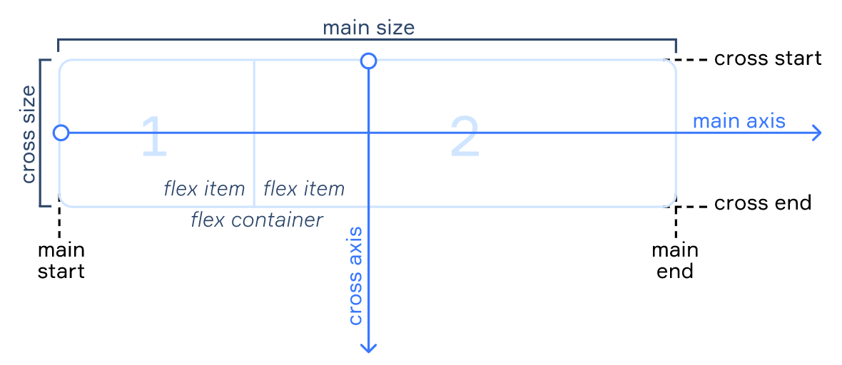
- Main axis: the axis that determines the direction in which all the elements are going to be placed by default
- Cross axis: the axis perpendicular to the main axis
- Main start/end: borders that determine where the flex container begins and ends
- Cross start/end: borders that determine where the cross axis begins and ends
- Main size: the size of the main axis
- Cross size: the size of the cross axis
Depending on how you want to align flex items, the dimensions may shuffle, meaning that the main axis will become the cross axis and the cross axis will become the main axis. This affects the way items are arranged: vertically or horizontally.
Setting up a flexbox
The property display: flex; is used to set a block up as a flexbox. All its child elements will automatically become flex items. They will be lined up along the direction of the main axis.
Example with 3 child elements:
<div class="flex-container">
  <div class="flex-item">item 1</div>
  <div class="flex-item">item 2</div>
  <div class="flex-item">item 3</div>
</div>
This is what it looks like with display: block; set to the flex-container:

And this is what happens if display: flex; is applied:

If the block has a text or an image not wrapped with <div></div>, they become anonymous flex items. In this case, the text will be stuck to the top, and the height of the image will be equal to the height of the container.
Important Details
There are a couple of things to keep in mind when working with flexboxes:
- Properties
display,float,clear, andvertical-alignare redundant for flexbox, so they will be ignored even if you set them. - You don't need to set the
display: flex;property for flexible elements, just apply it to the container that is the parent element. - If the values of
marginandpaddingare set as a percentage, they will be calculated based on the inner size of the parental block. - The default minimum size of the flex item is the minimal size of its content. Basically, it's
min-width: auto;. The minimum size of the elements with visible overflow is 0 by default.