Document Flow and Positioning
HTML documents are displayed on the page from top to bottom, so the elements that are described higher in the HTML file will be rendered in the browser earlier than those described lower.
The order in which the elements are displayed on a page by default is called normal flow. It corresponds to the value of the static position property. Changing the values of that property will change the flow of the document, which is a process called positioning.
Absolute positioning
Absolute positioning refers to positioning relative to the bounds of the parent element, out of the normal flow. Here is the syntax:
element {
  position: absolute;
}
If there is no parent element, then it is set relative to the bounds of the browser viewport. So, with absolute positioning, the browser window will act as a parent from whose borders the distance is set:

Of course, it can also be set from the border of a parent element that has any position other than static:

Example
In the picture below, four blue blocks are positioned in the normal flow, that is, their position is set to static by default:

If we change the positioning of the element 2 to absolute, it will instead look like this:

The elements in the normal flow neatly follow each other and occupy their space on the page. Absolute positioning basically pulls the element out of the normal flow and, as it happened in our example, lifts it up. Element 2 rises to the absolute level, and since it is not on the plane between the elements 1 and 3, they shift towards each other.

So, the absolute plane lies on top of the static plane, which gives the blending effect like in the above example.
In most cases, absolutely positioned elements have auto width and height sized to match their content. They can also be stretched to their full width or height if you don't set the element size manually, that is, if you leave it as auto.
To do this, you need to set the top and bottom or left and right properties to 0. This can come in handy, for example, to fill the entire height of the container:
.parent {
  position: relative;
}

.child {
  position: absolute;
  width: 50px;
  background-color: rgb(250, 135, 135);
  top: 0;
  bottom: 0;
}

Filling the width works in a similar way:
.child {
 position: absolute;
 height: 50px;
 background-color: rgb(250, 135, 135);
 left: 0;
 right: 0;
}

Having the position: relative in the parent class, makes the child class position itself relative to the parent.
Relative positioning
A relatively positioned element is set relative to its original position on the page. Take a look at the syntax:
element {
  position: relative;
}
Let's visualize it and consider an example. Here are four relatively positioned blocks:

Now, we'll move the even-numbered blocks to the right and the odd-numbered ones to the left by 50px:

The blocks have shifted from the center to the left and right. But relatively positioned elements have a peculiarity that distinguishes them from absolutely positioned elements. To see it, let's consider the same four blocks, but this time, only block 3 will be position: relative, and the rest will remain in the normal flow. To make the example a little clearer, let's move that block up a little:

Block 3, as expected, moved up by the distance that was indicated, but pay attention to the empty space where the third element had been earlier. The difference with relative positioning is the fact that the block exists on the page materially (the display of other elements around this block is calculated based on the space it occupies), but it still rises to a higher plane as an absolutely positioned element would. This way, block 3 overlapped with block 2, and block 4 stayed in place and did not move up.
This behavior allows you to move page elements anywhere without breaking the layout of the site because the occupied space remains duly occupied.
Fixed positioning
Fixed positioning is similar to absolute positioning, but it locks the element on the page relative to the visible part of the browser's viewport and maintains that position during vertical scrolling.
.header {
  background-color: rgba(255, 255, 255, .8);
  text-align: center;
  text-transform: uppercase;
  position: fixed;
  width: 250px;
}
<div class="body">
     <header class="header">
       <h2>Kitty</h2>
     </header>
     <div class="content">
       <img src="image_dfdvcix.jpeg" alt="">
       <img src="image_dsfsvcv.jpeg" alt="">
       <img src="image_ioeriou.jpeg" alt="">
     </div>
</div>
Here is what the result looks like:
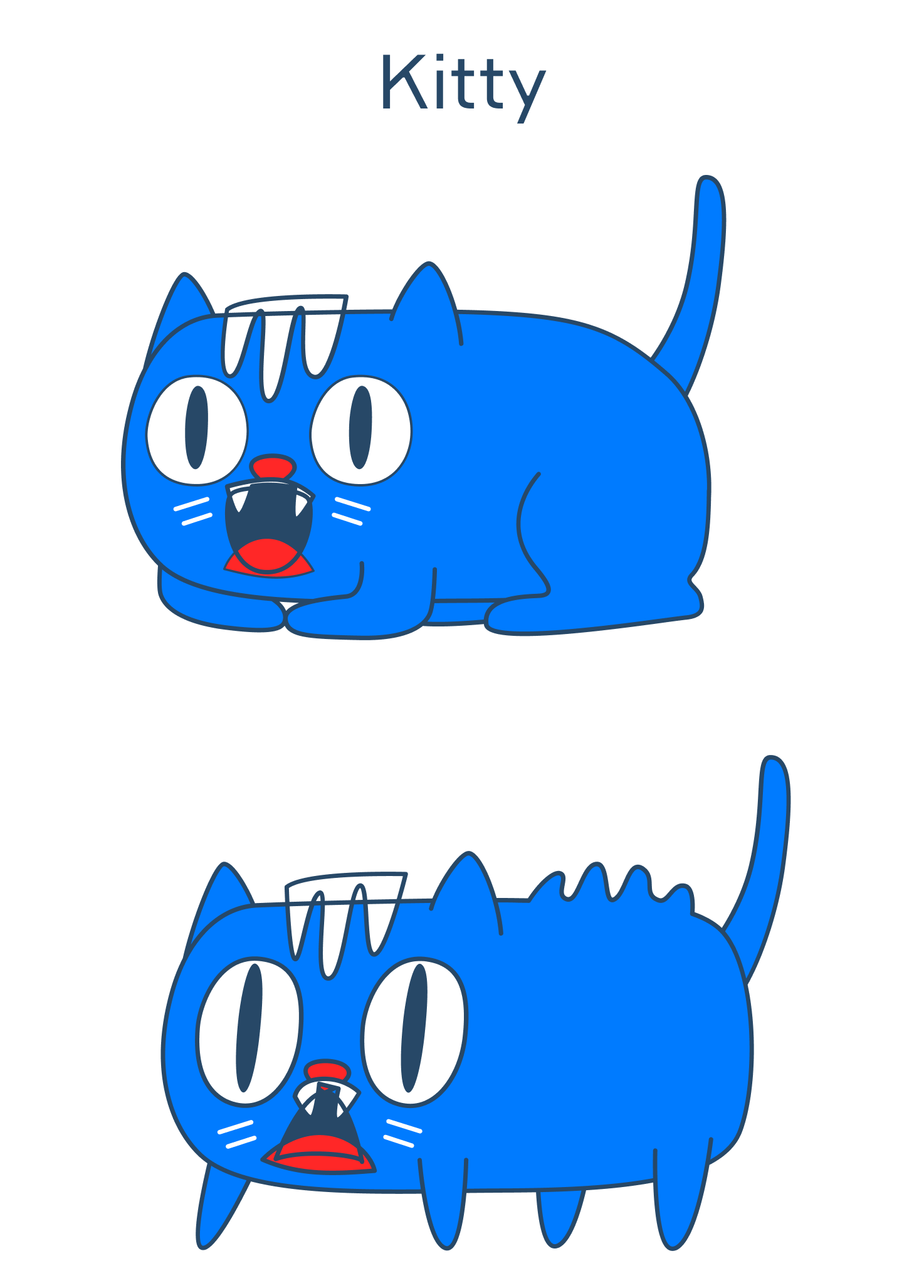
The title stays in place as the page scrolls with the images. Fixed positioning is often used for subheadings, menu buttons, content logos, back to top buttons, and so on.
Sticky positioning
Sticky positioning is between relative and fixed positioning. The element is positioned relatively until the page is scrolled to a certain point, after which the positioning will be fixed.
.sticky {
   position: sticky;
   top: 10px;
   width: 50px;
   height: 50px;
   margin-bottom: 150px;
   background-color: rgb(255, 255, 255);
   border: 1px solid black;
}
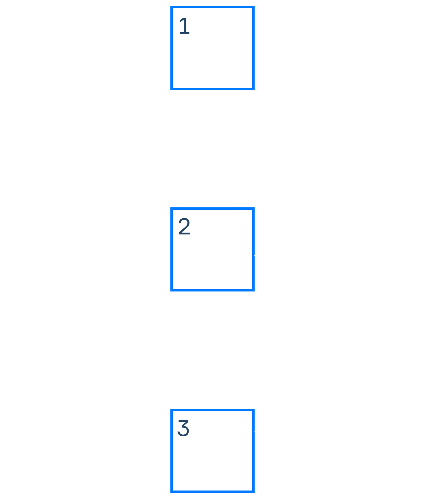
 <div class="parent">
   <div class="sticky">1</div>
   <div class="sticky">2</div>
   <div class="sticky">3</div>
   <div class="sticky">4</div>
 </div>
Note that in order for this type of positioning to work, you need to specify the limit point. The blocks will stop at this limit point, which in our case is the top property, 10px. When you're scrolling the page and reach that point, the elements will stack one on top of the other as shown in the animation below:
If the top property is removed, the positioning will be similar to relative:
